Ericsson Icons
Company:
Ericsson
Date:
Dec 2017 (first release)
Role:
Lead designer

With the redesign of the Ericsson brand and the creation of the Ericsson Design System, there was a need for a new set of icons. Initially, I provided feedback to Stockholm Design Lab, the agency involved in Ericsson’s rebranding. Although after some time, I got to take over the work on the icons. In many ways, this was a natural step. I was already involved in the making of the design system, and through my network, I was informed of Ericsson’s product specifications and users. Additionally, I had become aware of the shortcomings of the current iconography, and I had a vision of how the new icons should be designed and used.
Purposeful iconography
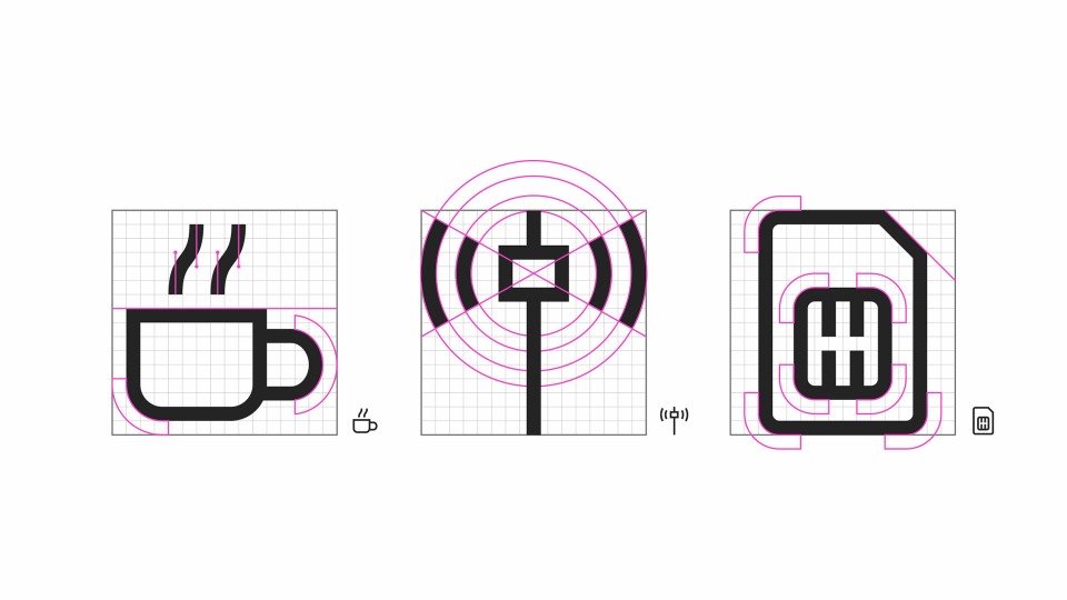
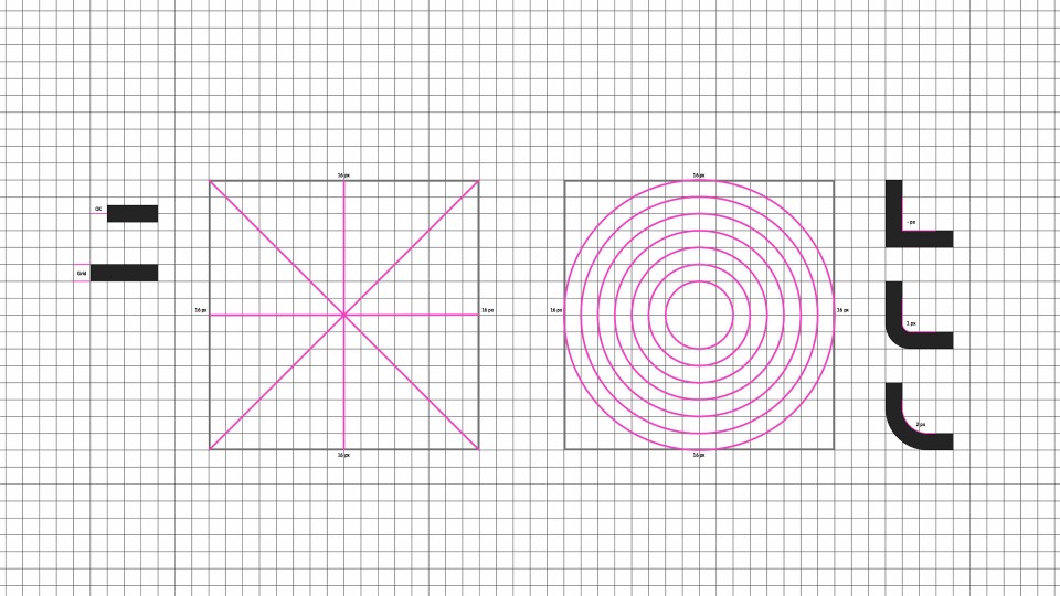
When I took over the work on the icons, the new Ericsson Hilda font was already taking shape. As a matter of fact, “Hilda” had very much been developed as a top priority. I felt that it was important that the new icons would match the new font. So when I started to design the first icons, I would make these harmonize with Hilda. Each icon would use 1 px stroke. Similarly, they would lean more towards hard shapes and edges. I also followed the “Quest for Easy” principle and tried to design the icons without unnecessary details. These design choices resulted in crisp and clear icons. Ensuring high legibility. And as a result, a close relationship with Hilda was achieved.
Similarly, during the development of the new iconography, we looked back at the old brand. The previous Ericsson icons had some shortcomings we wanted to avoid. For example, in the old brand, there were two completely different icon libraries. One was for marketing and communication, while the other was for software. This had led to confusion. On top of this, the libraries had grown to include niche symbols, icon-on-icon combinations, and unclear use of color.
The new Ericsson icons solved these problems. As a start, we agreed that we should try to limit the icon library so it would just include standard symbols. On top of that, I made sure that the new icons used the same design language. They were created with the user in mind and kept light and elegant. Additionally, the inclusion of clear guidelines helped designers and developers to optimize the use of icons. Giving icons a prominent role in the new brand identity.

Animations
With the evolution of the Ericsson Design System arrived a need for animated icons. One example was the notification icon. As I worked on the notification component, as well as the notifications log, I designed a bell icon (the standard symbol for notifications and alerts). However, I realized that the icon needed to be animated since it had more than one state. As it happened, I gave the animation a distinctive ding-dong effect. This worked well with the notification messages, which would animate in from the right of the screen.
Another icon that I animated was the loading animation. Instead of using a spinner, we in the design team took a bold decision. We felt we could pay homage to Ericsson’s design legacy. We did this by using the rotary dial on the classic Ericofon to symbolize loading. Instead of spinning continuously, the dial would turn till it reached its limit and then return to its original position. Similar to how a real rotary dial behaves.
Marketing and apps
The icons for the design system defined Ericsson’s new, purposeful iconography. Following in the footsteps, the Brand Design team asked me to lead the design of the marketing icons (pictograms). The intent of the marketing icons was events and campaigns.
As I turned out, I got the opportunity to lead a team of designers that refined and created the new, Ericsson marketing icons. Apart from planning and organizing the project, I gave direction and guidance to the team. I also made sure that the instructions and design documents that I had previously created worked and could be used by other designers. And most importantly, assessing that all marketing icons perfectly aligned with the rest of the library.

As a way to make all icons accessible to the whole Ericsson community, I designed and ordered them in a single, easy-to-use document. Since this document included every icon as an SVG, users could easily copy and paste icons into presentations. This also allowed them to scale icons as well as changing their colors.
Great work on the icons. Tidy and well presented.
― Brand Design Director, Ericsson Group Functions
Another need at Ericsson, following the rebranding, was to come up with a system for app icons. Although few in numbers, Ericsson’s product library included several apps for iOS and Android. Building on the brand assets, I created several alternatives to visualize apps. Using the new brand colors, font, and icons.
