Ericsson Design System
Company:
Ericsson
Date:
2017 – 2020
Role:
Visual & interaction designer

In 2018, at the Mobile World Congress in Barcelona, Ericsson announced its new brand identity: “The quest for easy“. Moreover, the company shared its new vision and purpose: “Empowering an intelligent, sustainable and connected world by relentlessly innovating technologies that are easy to use, adapt and scale“. Alongside the new brand was the recently released design system for software development, the Ericsson Design System. I played a key role in its creation as well as its ongoing support.

Return to Ericsson
I joined Ericsson in August 2017, having previously worked for the company as a consultant in 2015. Back then I was part of the IPTV Multiscreen team. This time I became a member of the Experience Design team, belonging to the business unit Digital Services. The team was in the early phases of creating a new design system. The initiative to create a modern and user-friendly design system was one part of Ericsson’s bigger rebranding strategy.
When I started in my new position, there had already been some early concepts and explorations created. Similarly, the design system principles were also in place. But the interaction patterns, components, guidelines, code, etc. were not existing. Apart from organizing ourselves, we also started to work closely with the Ericsson Brand Design team and the agency Stockholm Design Lab. Together we agreed on a strategy to deliver the best possible brand and user experience. Our goal with the design system was to create a tool that would speed up design and development and help Ericsson achieve a coherent digital portfolio.
Early prototyping
In the midst of the initial design system work and brand discussions, the team received an assignment to create a prototype for a small IoT sensor called Scout. This “side quest” gave us a chance to try out various ideas, such as the early components and design assets, on a real product. I was given the responsibility to drive and deliver the project, together with the lead developer of the team.
We worked on the prototype for a little more than a week. In the end, we managed to create a realistic flow that covered the whole use case. The stakeholder was pleased with the results. After showing the prototype to the leadership team, the stakeholder came back and informed us that the demonstration had been a success. The leadership team both appreciated the innovative solution and the new visuals. Thanks to the project, we learned many things that we initially were unaware of. We used the findings to improve the previous explorations of the design system.
Organizing the design team
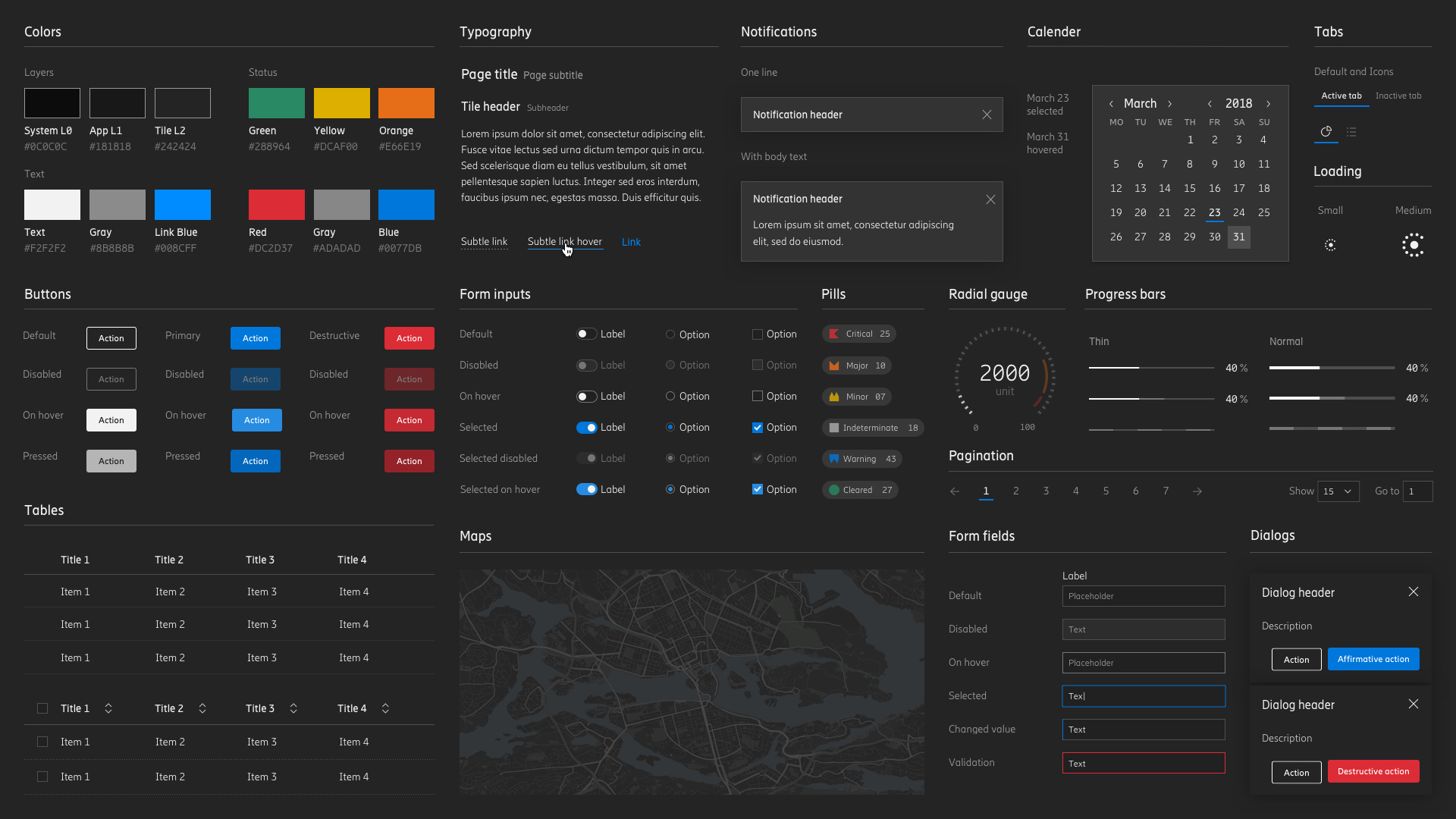
Once the Scout project had been finalized, I joined the rest of the team to work on the design system components. I became responsible for the tables, pagination, pills, and filtering functionality. In addition to creating components, I was appointed the lead designer of the Ericsson Design System icons. Apart from creating the first batches of new icons, I also took on the responsibility to define iconography guidelines, rules, and best practices. Not only on a design system level but for the whole Ericsson brand. Later, I was unofficially dubbed the company’s icon expert (read more about how I defined Ericsson’s new iconography here).
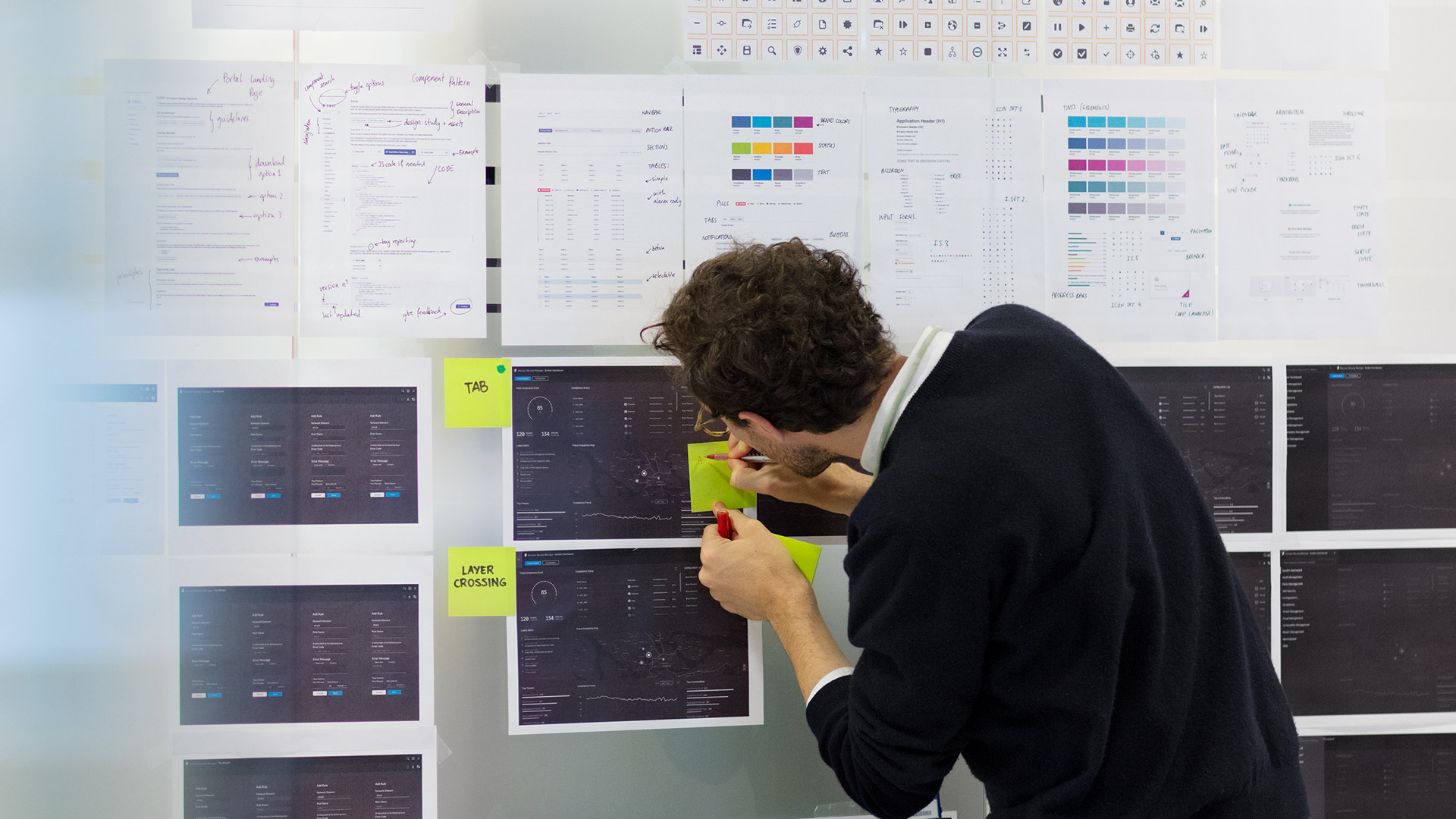
As time progressed, we felt we needed to improve the communication on the team. To ensure consistency and high quality in our work, we set up review and feedback sessions. In these sessions, we would show designs, share our rationale, and discuss with our colleagues. Sometimes we invited external people, such as product owners. Apart from the feedback sessions, we also ran several design workshops, where we invited other designers in the company. During these workshops, we would gather specifications and needs. We would also brainstorm on different ways to move forward and make design decisions. Among the topics we discussed were our users, different types of navigation, layout, and hierarchy.
The design team had a flat organization where everyone was on the same level. Although, from time to time I would lead the team, plan objectives, and run the daily stand-up meetings.
Visual language
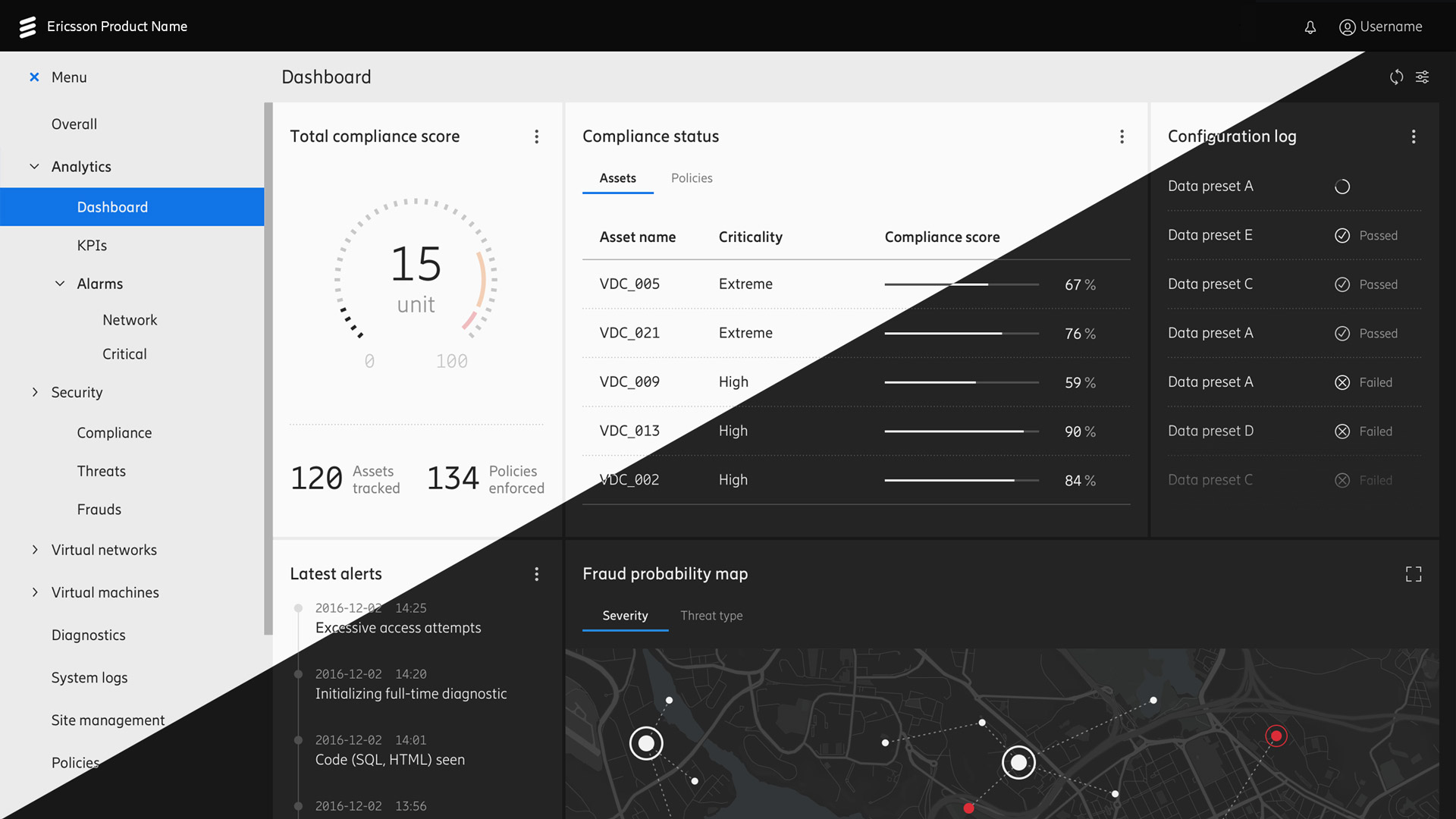
Ericsson Design System was built as a three-layer system and with two themes, a light and a dark one. The reason for having two themes was to give users the option to configure the screen according to their preferences. Also, depending on a user’s environment and working conditions, ensure that information gets rendered in the best way possible.
The three-layer system was designed in a way so it would offer a familiar and clear structure. The System layer (the first, backmost layer) would hold global actions and information. The Application layer (the second, middle layer) would have context-dependent actions. While the Content layer (the third, highest layer) would divide information and present it on a grid of tiles.
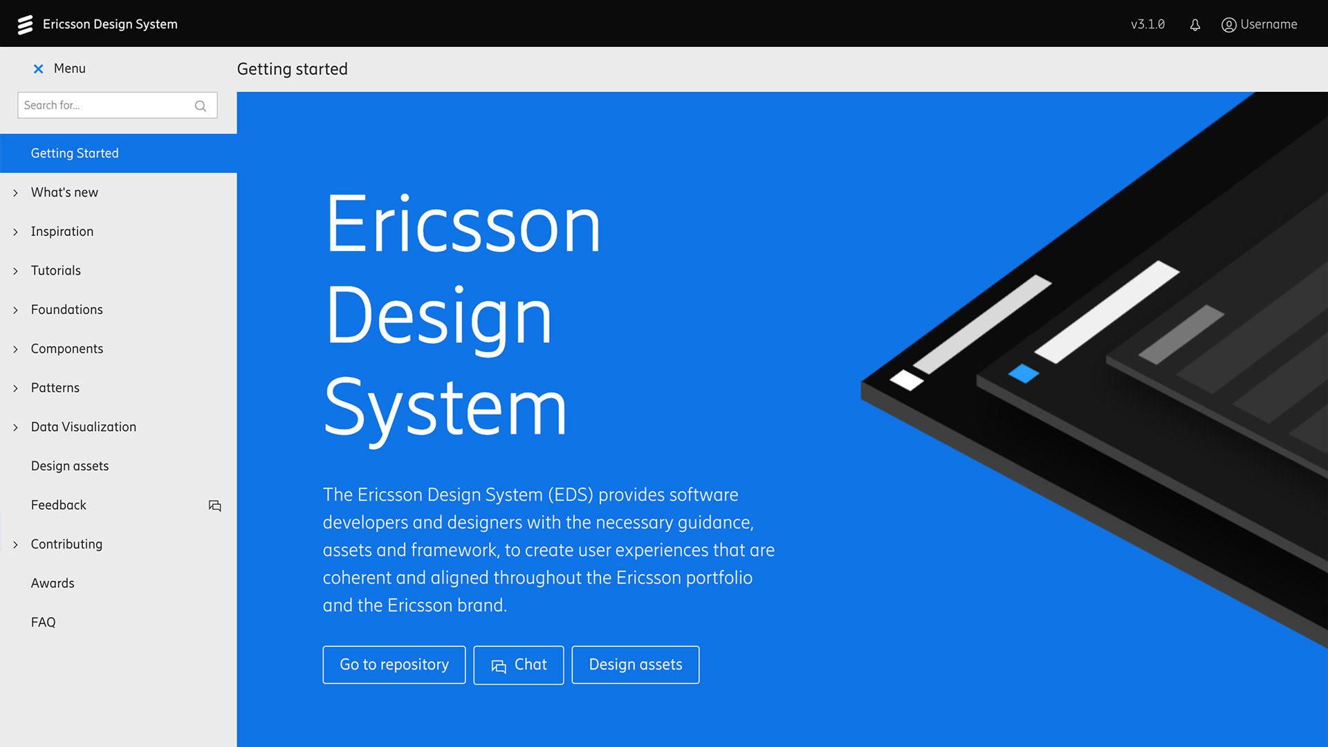
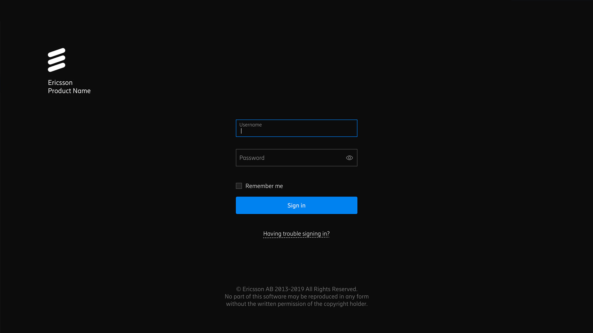
The Ericsson Design System portal itself was built as a real application, using the same components and patterns as Ericsson products. Apart from having ready-to-use code, we included design assets for common design tools, wireframing documents, and a UX toolbox. Additionally, certain patterns were built as templates, such as the Sign in screen (as the sign in process would be similar for all Ericsson products).
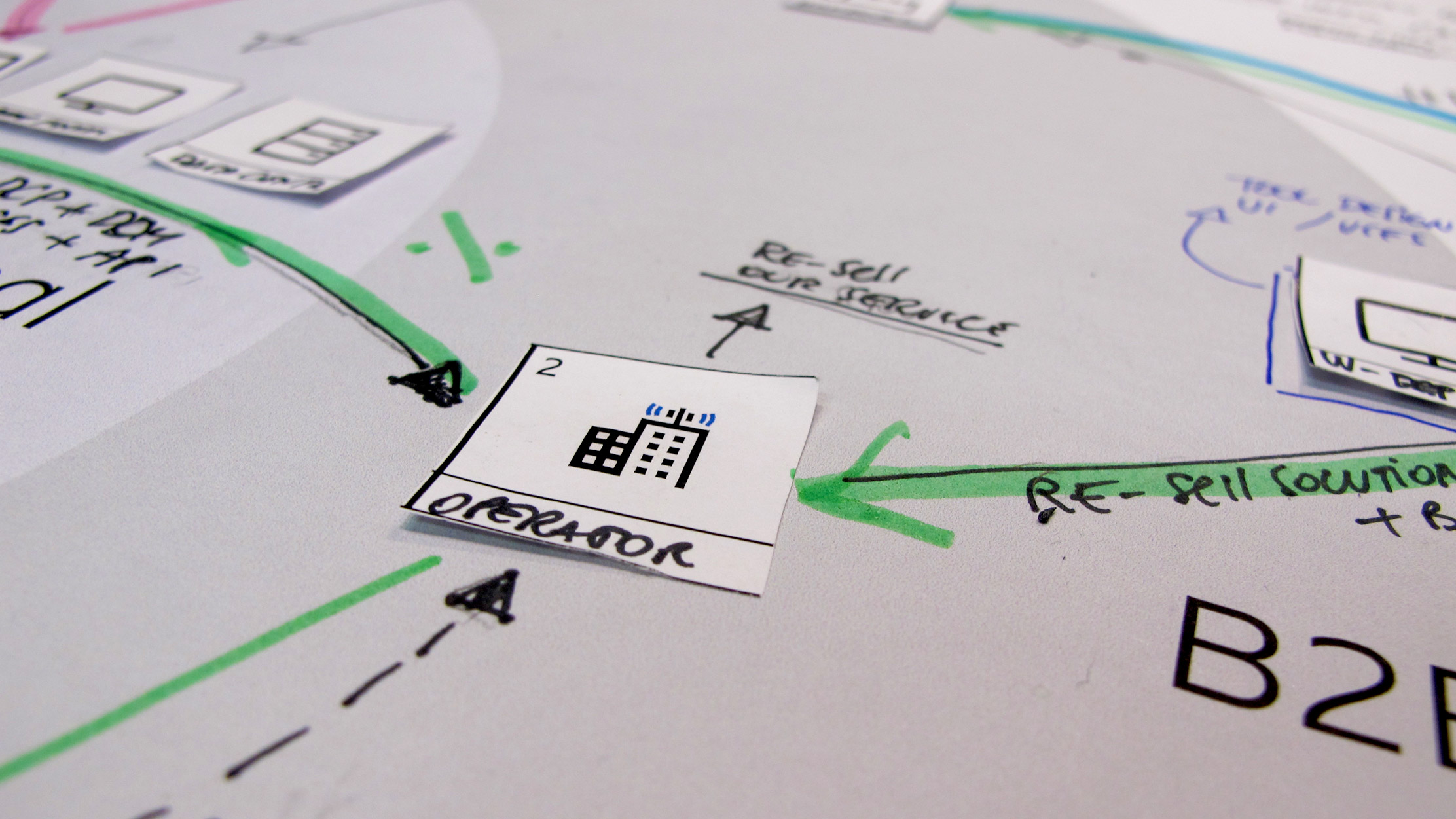
Marketing and concepts
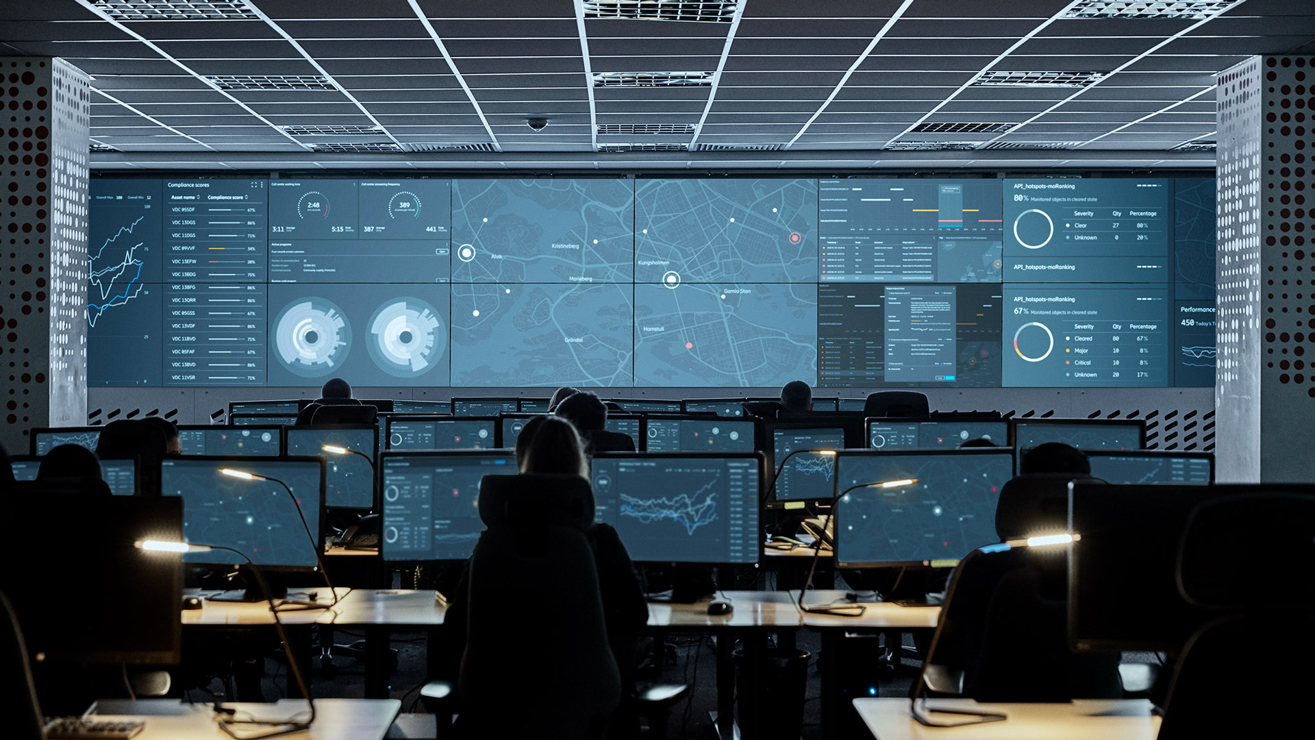
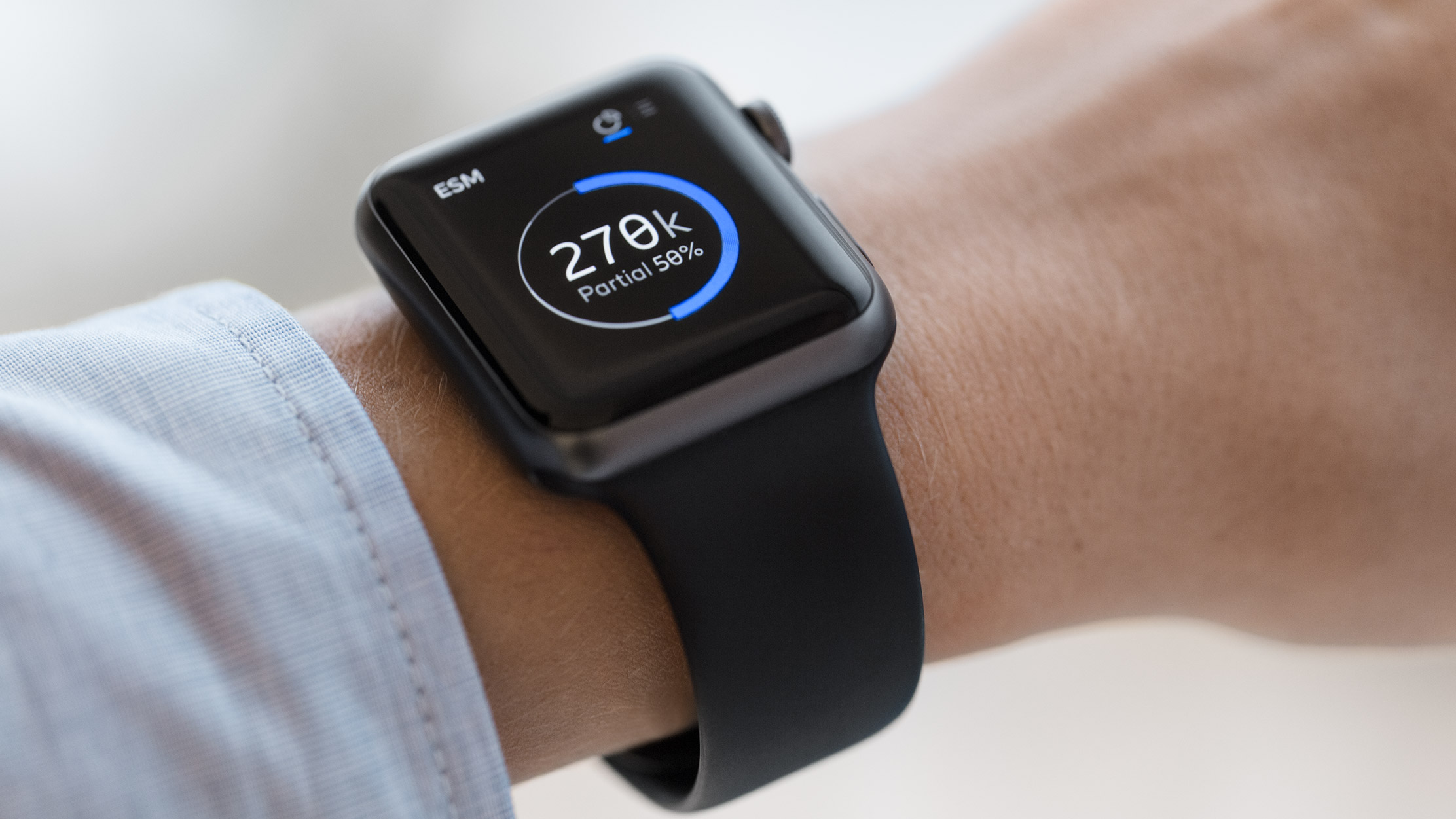
We released the new design system at the end of 2017. At the same time, we initiated a project with the marketing team to showcase the new digital look-and-feel. As a result, I got the opportunity to coordinate and work with a couple of external agencies. The project eventually led us to create a campaign that aligned with the rollout of the new brand. The campaign showcased the design system on different devices, such as a smartwatch concept for Ericsson Security Manager. We also produced examples of network operations centers with the new Ericsson visuals.
Early adopters
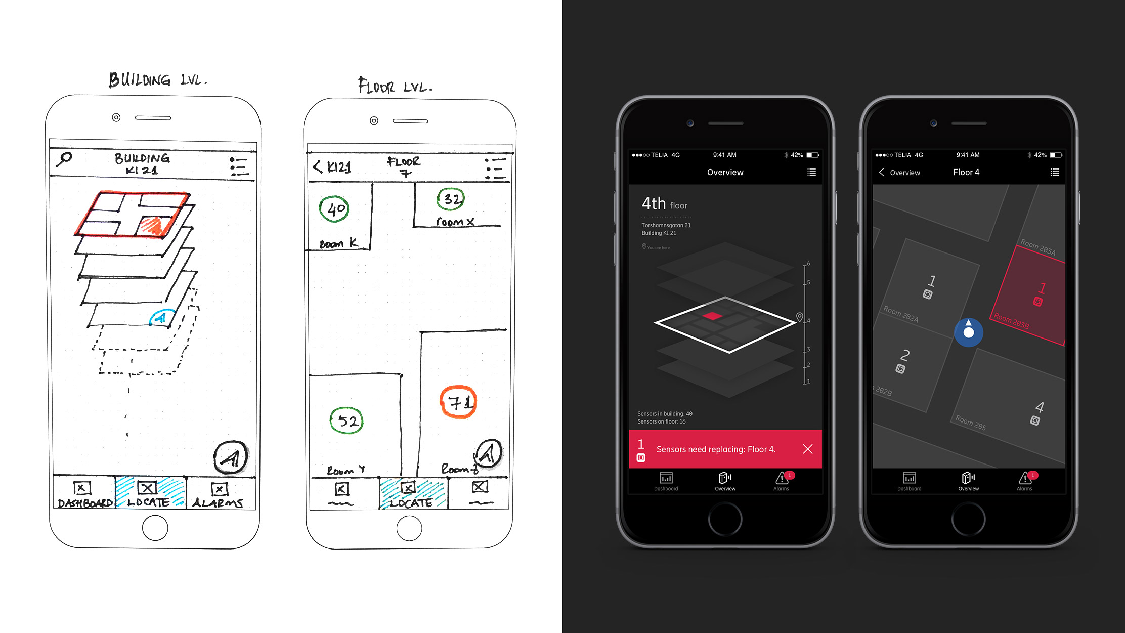
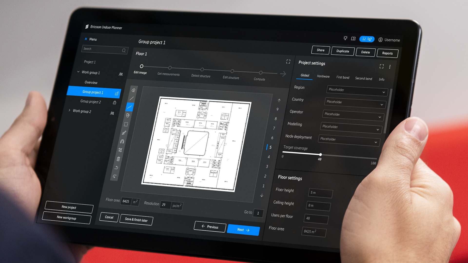
Some products in the Ericsson portfolio became early adopters of the new design system. One of these was Ericsson Indoor Planner, a tool to plan and simulate indoor networks. The existing product had been developed as an application for mobile tablets. The project allowed me to work with an Ericsson team in Ottawa in Canada. I provided the team with recommendations, guidelines, and visual assets. For example, screen designs, animations, and icons. The work I made in the project eventually got ported to the design system. One example was the notification pattern and log. Hence, it was a good example of how Ericsson products would help feed the new design system.
Indoor Planner was one of the first Ericsson products to migrate to the new brand. Consequently, the project outcome was a better and more improved application than the previous one. The stakeholders complemented the results of the project and our collaboration.
We released Ericsson Indoor Planner 19.1 one month ago now. It has been a very successful release.
We developed a very professional product. Thanks for your help.― Lead developer, Ericsson Indoor Planner
Awards and recognitions
Ericsson’s rebranding was a success. To follow up on the achievement, we decided to submit the design system to various design competitions. As it turned out, I was chosen by the team to handle the submissions.
Before we began, we felt we needed something that could summarize and explain the design system, in a simple way. For that reason, we got help from the House of Radon, a production company in Stockholm. We decided we would create a promotional video (seen at the top of this page). As a start, I wrote an initial script and presented the general scope and direction of the video. What followed was the production, which stretched for a couple of weeks. Apart from representing Ericsson and the design system team, giving feedback and direction, I also provided some unique designs and visuals for the production team.
The promotional video became the main piece in the award submissions. Apart from the video, we also included material that showcased the new visuals and design assets. Ultimately, the Ericsson Design System received a Red Dot Award in the category “Interface design” in 2018. On top of that, it won another Red Dot in the category “Brand Design and Identity” as part of the bigger Ericsson brand.

In 2019, Ericsson Design System got an iF Award in the category “Apps and software”. Furthermore, it got an award in the category “Corporate identity and branding” with the new Ericsson brand. I got the opportunity to attend the iF Award ceremony in Munich in March 2019, together with my managers and the head of the Ericsson Brand Design team.
In addition to these awards, Ericsson also got recognition in the, in Sweden, famous competition Guldägget (The Golden Egg Award).
For info about the different awards, please see the links below: