Ericsson IPTV Multiscreen
Company:
Ericsson
Date:
July 2015
Role:
Visual designer

The company Ericsson has a history within TV and media. Initiatives in these fields were for a time organized under Business Unit Support Solutions. One example of such an initiative was the IPTV Multiscreen solution. I had the opportunity to work as a consultant in the team responsible for Ericsson’s IPTV Multiscreen user experience and interface design.
Designing for TV (and more …)
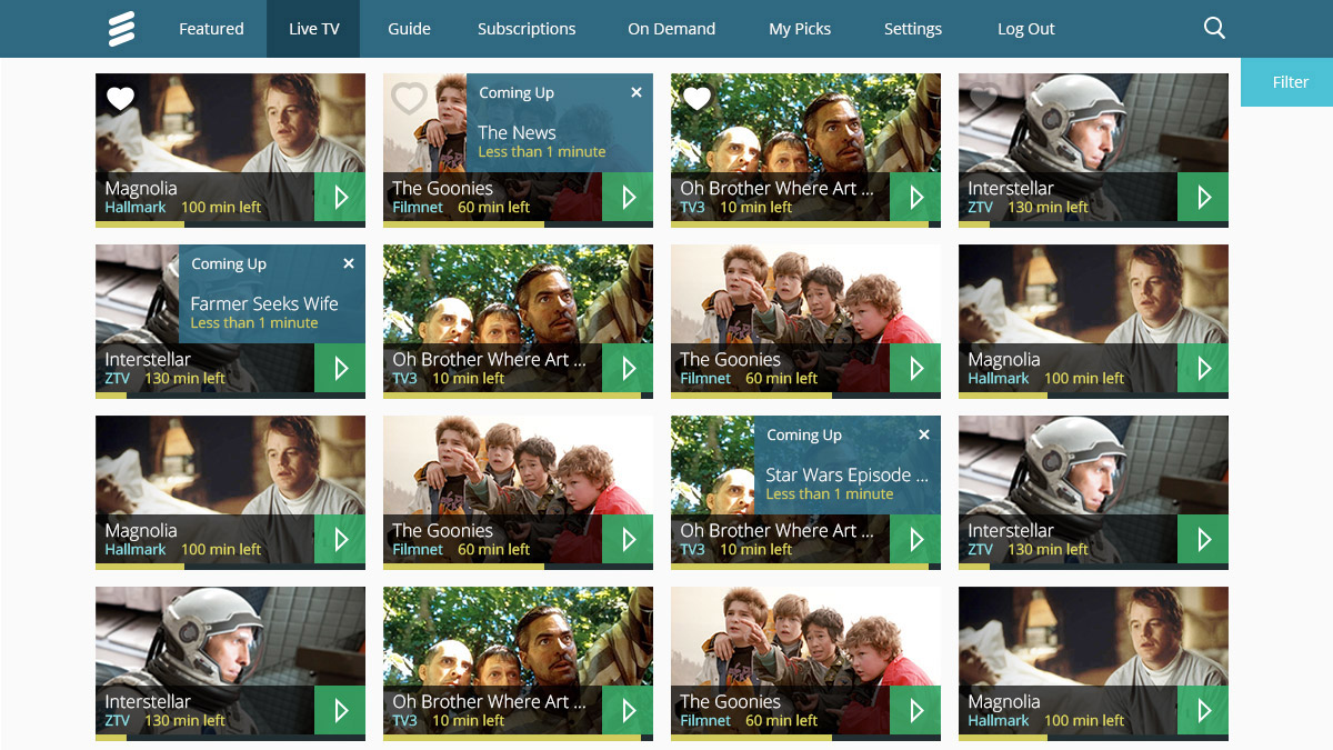
I was hired by Ericsson at the beginning of 2015 and joined a team with around 20 members. A mix of project managers, developers, testers, UX designers, and UX researchers. The team was working on an IPTV streaming solution for set-up boxes – called IPTV Multiscreen Client Suite. Similarly (as the name suggests), it also supported second-screen devices, such as tablets and mobile phones. There was already a functional IPTV system in place, with a solid back-end setup. What was lacking was an intuitive user interface. The interface that was existing at the time was not following any design principles or standards. Some sections, such as browsing favorite shows and filtering, were broken and looked strange. The front-end had, in other words, not been given the attention it deserved.
The IPTV Multiscreen solution was built as a sort of Content Management System. The idea with the solution was that it could be customized, similar to a CMS. To put it another way, it was a front-end template. Depending on customer needs, various assets could be changed. Thus, the design had to take into account different branding scenarios.
Since the project was on a strict time plan, we could not make any big changes to the back-end code. Similarly, we had to follow an already defined layout as much a possible.
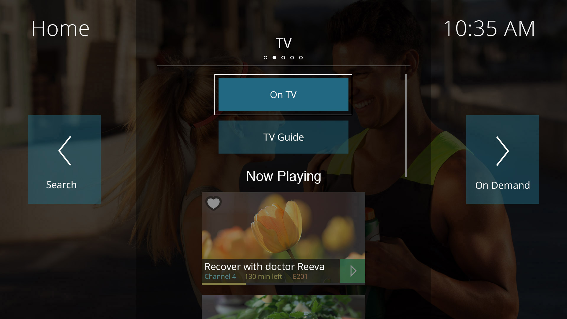
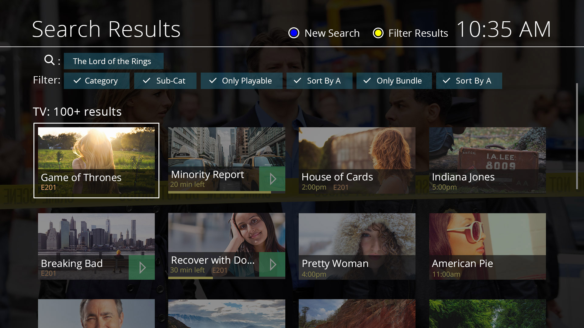
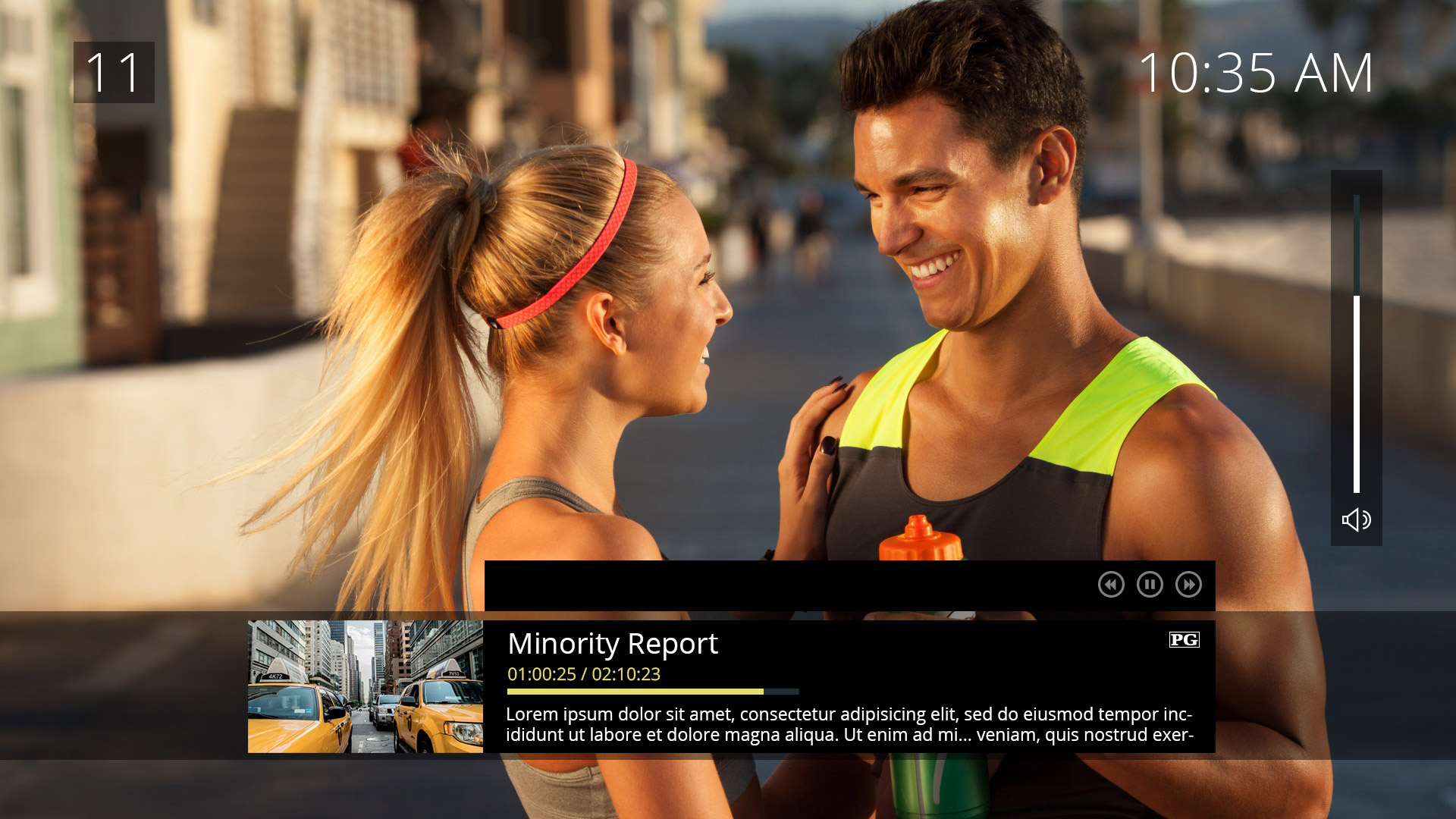
The UX group, which consisted of myself and four others, worked closely together. For instance, we had daily meetings and took decisions together. Our first assignment was to agree on the designs for TV since this was a priority. We started producing simple sketches and wireframes. At the same time, we started testing several color schemes, fonts, and transparency settings. This was a means for us to evaluate and see what was working. Eventually, we settled on a green and blue color palette. As our test showed, this palette provided good contrast and had a natural look and feel. At the same time, we decided to give certain elements a specific color, such as Video On Demand content.
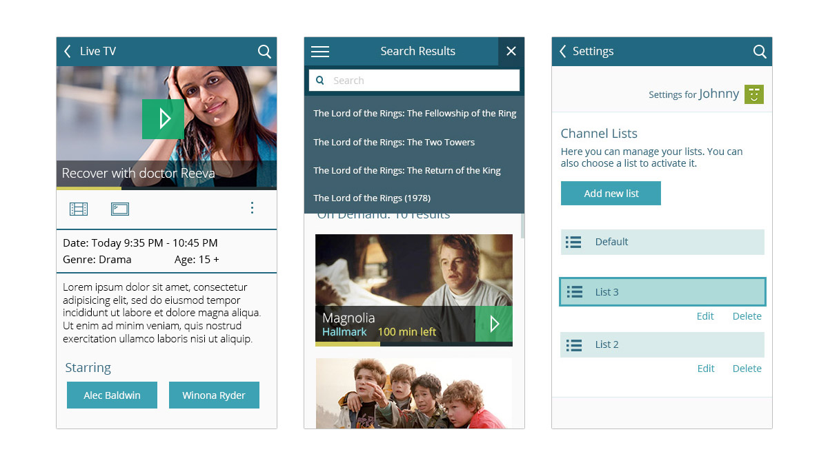
On the contrary to what we first expected, I had to start earlier with the designs for mobile phones and tablets. In a sense, this was good since it enabled us to adjust and balance the designs between TV and the responsive screens. At the same time, I started to work on a light and modern icon library consisting of various media functions.
As means to communicate design with the rest of the team, I worked on a style guide. The idea with the style guide was to have a single source of truth document. It would include design rationale, information, and instructions. Additionally, it would have sections highlighting the user experience principles and summaries of the user research. We also included personas. In the end, the style guide covered everything that the UX team had worked on and defined.

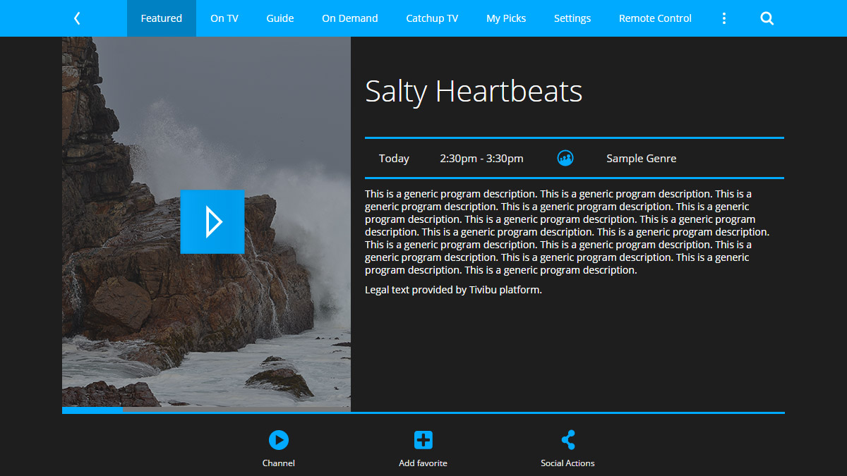
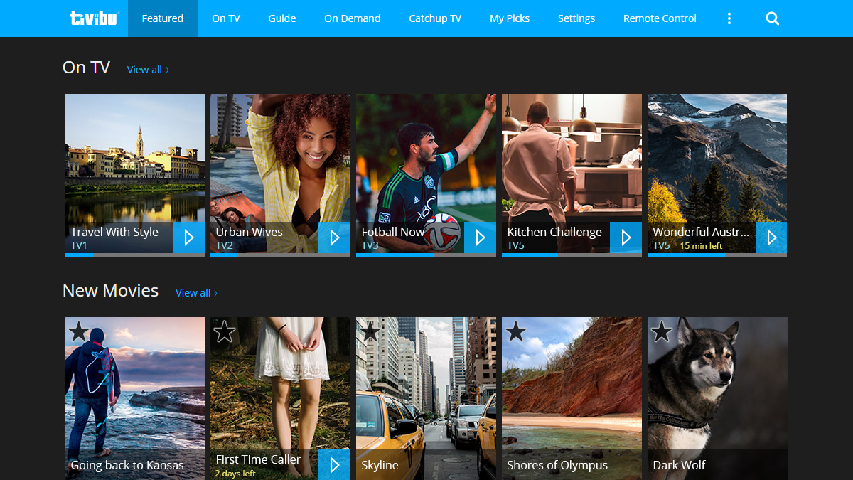
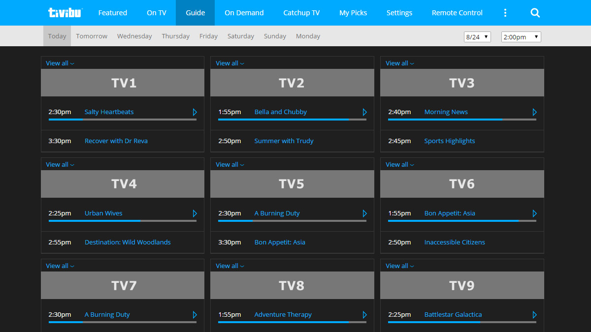
Customer branding
Alongside the new design for the IPTV Multiscreen was a customer branding project for Tivibu, a service from the Turkish company TTNET. This allowed us to test different features in the template. For example, it allowed us to see how the various design elements worked when using another company’s brand assets. On top of that, it also gave us a chance to try out a dark theme.